
We use cookies. They allow us to analyze the experience of visitors to our website and understand you better. By continuing to browse the website, you agree to our use of cookies.
Mobile app from scratch, 157,000 users and E-com ecosystem
The largest network of cafes and bakeries in St. Petersburg, with over 80 locations, has a cool website and its own app
Goals:
- Develop a new design – the old one was morally outdated, and there was a need for a fresh perspective.
- Build an application from scratch – the previous application was written in a cross-platform language and wasn’t suitable for scaling and implementing new ideas.
- Increase the maximum system load capacity – it was necessary to redesign the architecture so that the application could handle peak user loads during holidays.
Challenge:
Transforming the just bread-buying app into a super app where users can read articles, attend events, or immerse themselves in the city’s atmosphere.
Results:
- Overhauled the app design: revamped the UI/UX, added unique illustrations, and creative features.
- Within 9 months, we developed an ecosystem that combines numerous functions and killer features while remaining simple and user-friendly. Now, the app allows users to read articles, choose events, and more.
- Enhanced the architecture. The first of September – one of the peak days – went smoothly without any issues.
Before:
- Access to the catalog was only available to authorized users.
- The app was only used to display a QR code at the cashier.
- Login was based on a username and password, which were often forgotten.
- The catalog entry was not straightforward.
After:
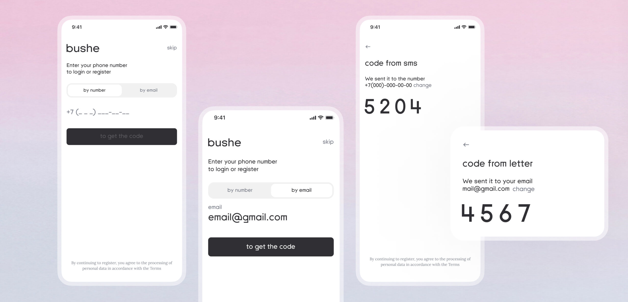
- Authentication based on the phone number – no need to remember a password.
- Access to the catalog is available even for non-authorized users.
- Now, you can not only order food but also learn about the city’s life and the company, read articles.
- Intuitively understandable design.
Project Features:
The client already had an application built on the Xamarin cross-platform development framework. It connected 80,000 active users to all internal systems: the point of sale (POS) system, customer relationship management (CRM), and the loyalty program.
Our task was to retain the capabilities of the old application, introduce new features, and make it simple and user-friendly.
Work Stages
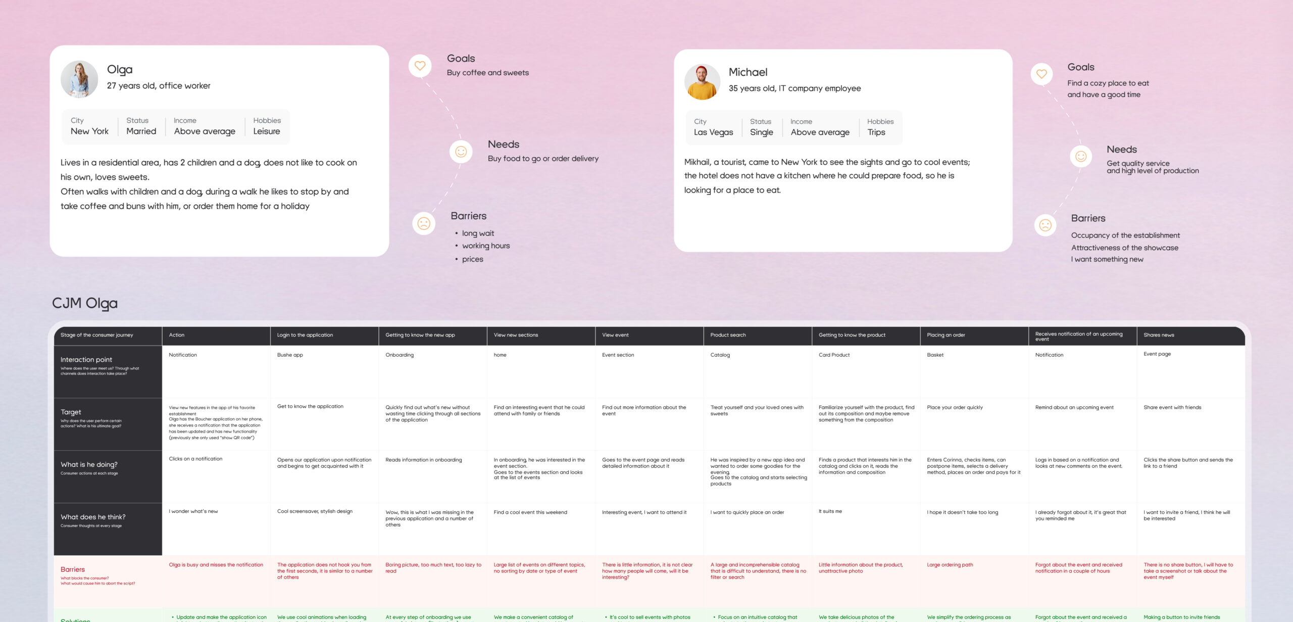
Analysis
We started by creating Customer Journey Maps (CJM) and Action Maps to identify the primary needs of users in the Bushe app. We conducted research on the old application, prepared descriptions of the AS-IS (current state) and TO-BE (desired state).
We developed a functional map and a new structure for the mobile application. During the analysis phase, we redesigned the navigation structure to make it more intuitive. We also introduced new sections that were not present in the previous application.”
Design
The client already had an established brand with its colors and tone of voice. However, they were open to bold design ideas.
We conducted UX research on more than 10 applications and analyzed their functionality for users. We categorized features into those that could be incorporated into our app. We also determined what we absolutely did not want to see in the future product.
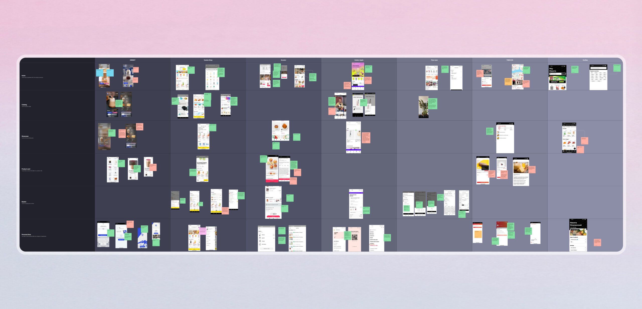
Based on this, we initially prepared a prototype, and only after that, we began working on the components and layouts.
We assembled a beautiful and user-friendly UI kit.
Development
In the previous application, there was already a system for products and services. We decided to start from scratch because rewriting the old code with the addition of new features would have taken as much time, but with more complexity.
Bushe has more than 80 locations, which puts a significant load on the system, especially during holidays. The old application couldn’t handle the peak load, resulting in incorrect functioning, order losses, and negative feedback from customers who couldn’t use the loyalty system.
Therefore, we designed a new architecture. We addressed the load issue by dividing responsibilities. We separated the backend of the application into several services, each independently performing its functions. This allowed us to evenly distribute the load and gain the benefit of improved application speed.
Result
In the new application, we simplified navigation and authentication, making the catalog accessible even to unregistered users. We introduced a page with stories, promotions, and articles.
Recently, on September 1st, the application worked without any issues. There are now over 1,570,000 registered users, and no problems arise. The development took us 9 months.
Login Splash Screen
A new animated login splash screen, the ‘Croissant Schrödinger,’ was added to the app as an Easter egg for our loyal customers.
Authentication and Registration
Now, you can log in using your phone number, eliminating the need to remember your username and password. At the same time, we maintained backward compatibility for old users – they don’t need to register again in the new app; all their data was migrated from the old application.
The previous application was not developed by us, so we didn’t have access to the codebase. This posed a bit of a challenge in solving the task.
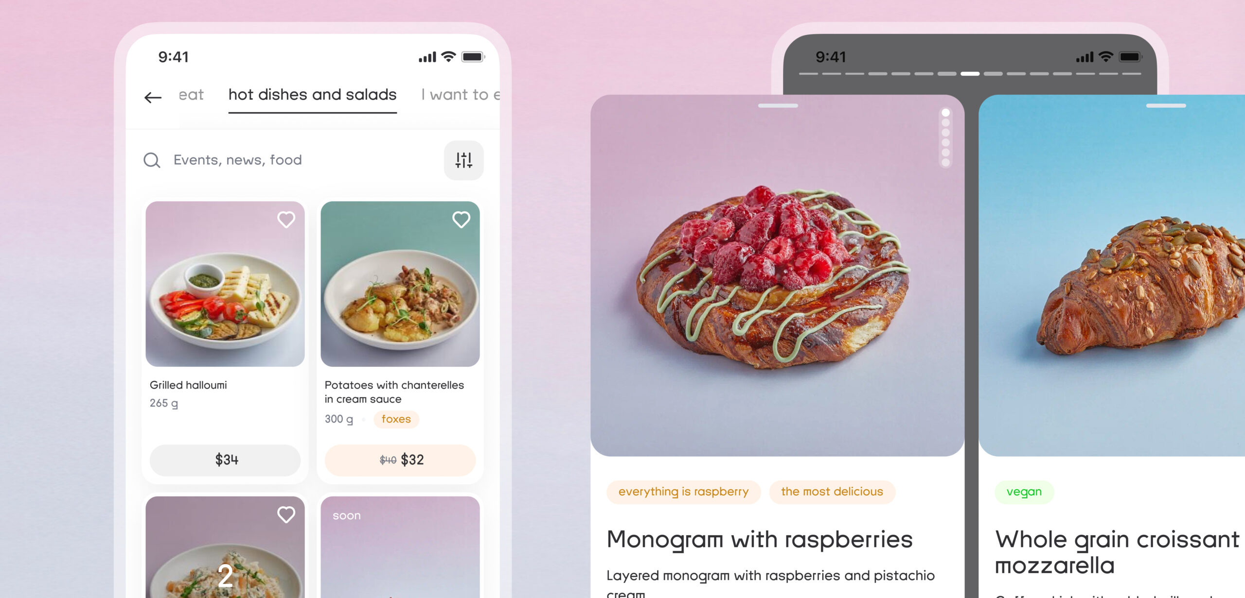
Home Page
We designed a lightweight and intuitive interface to ensure that users could navigate the new functionality without needing assistance. At the same time, the main functions remained visible.
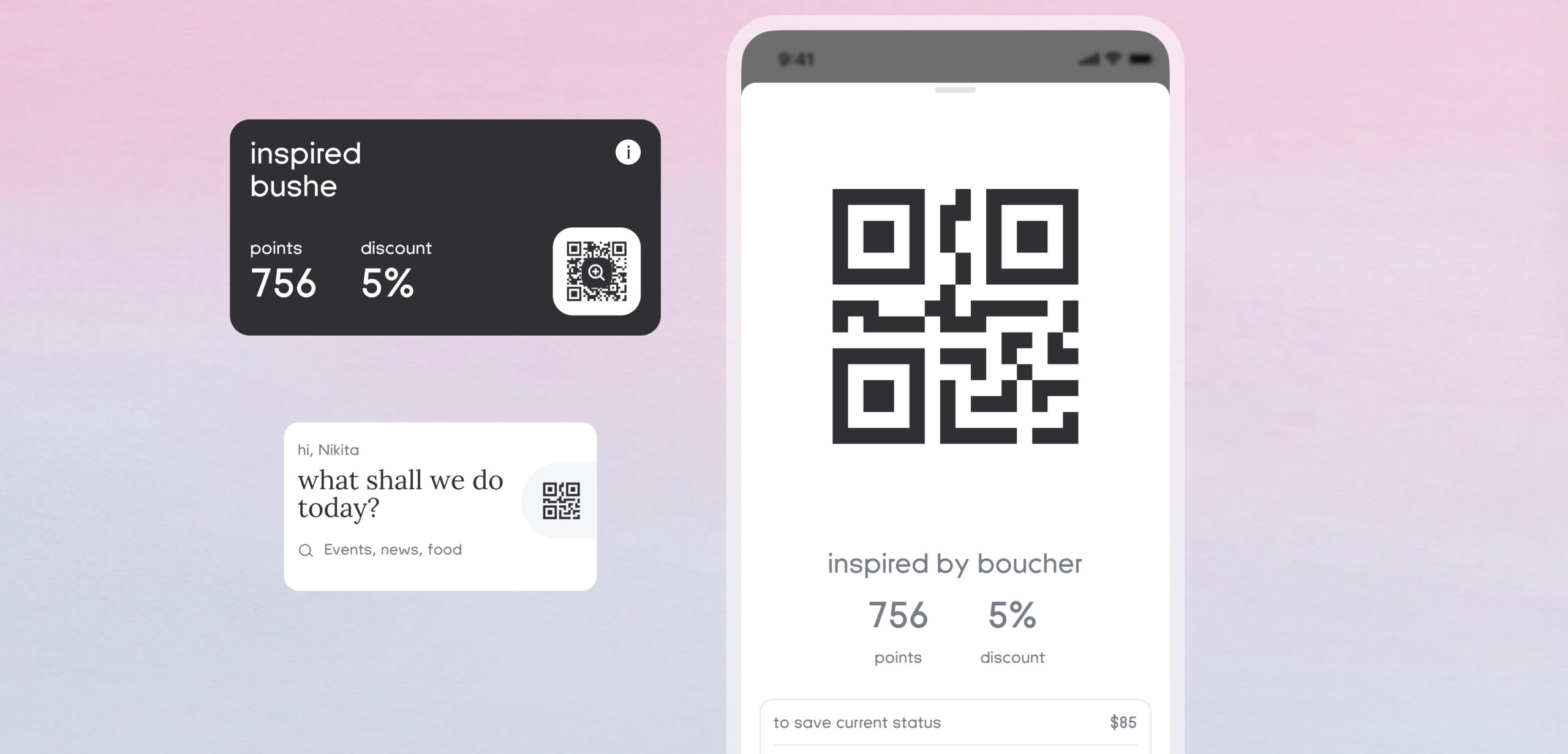
For example, on the home page, there’s quick access to the QR code, ensuring instant access at the cashier.
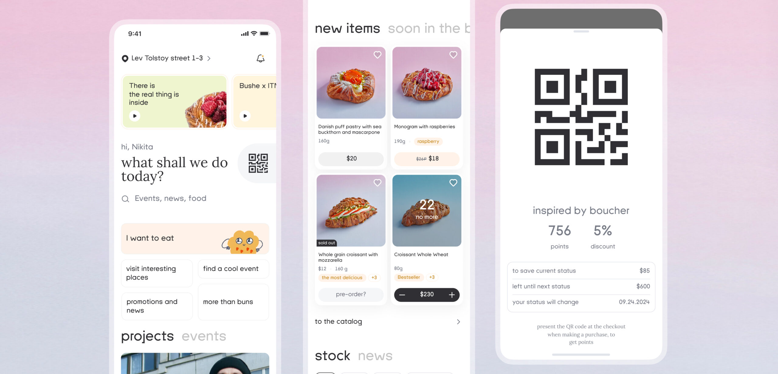
We’re conveying the central idea of the new app – Bushe is no longer just about food. On the home page, users can navigate to ‘More Than Just Buns’ and read articles about the company’s life or learn the product’s history.
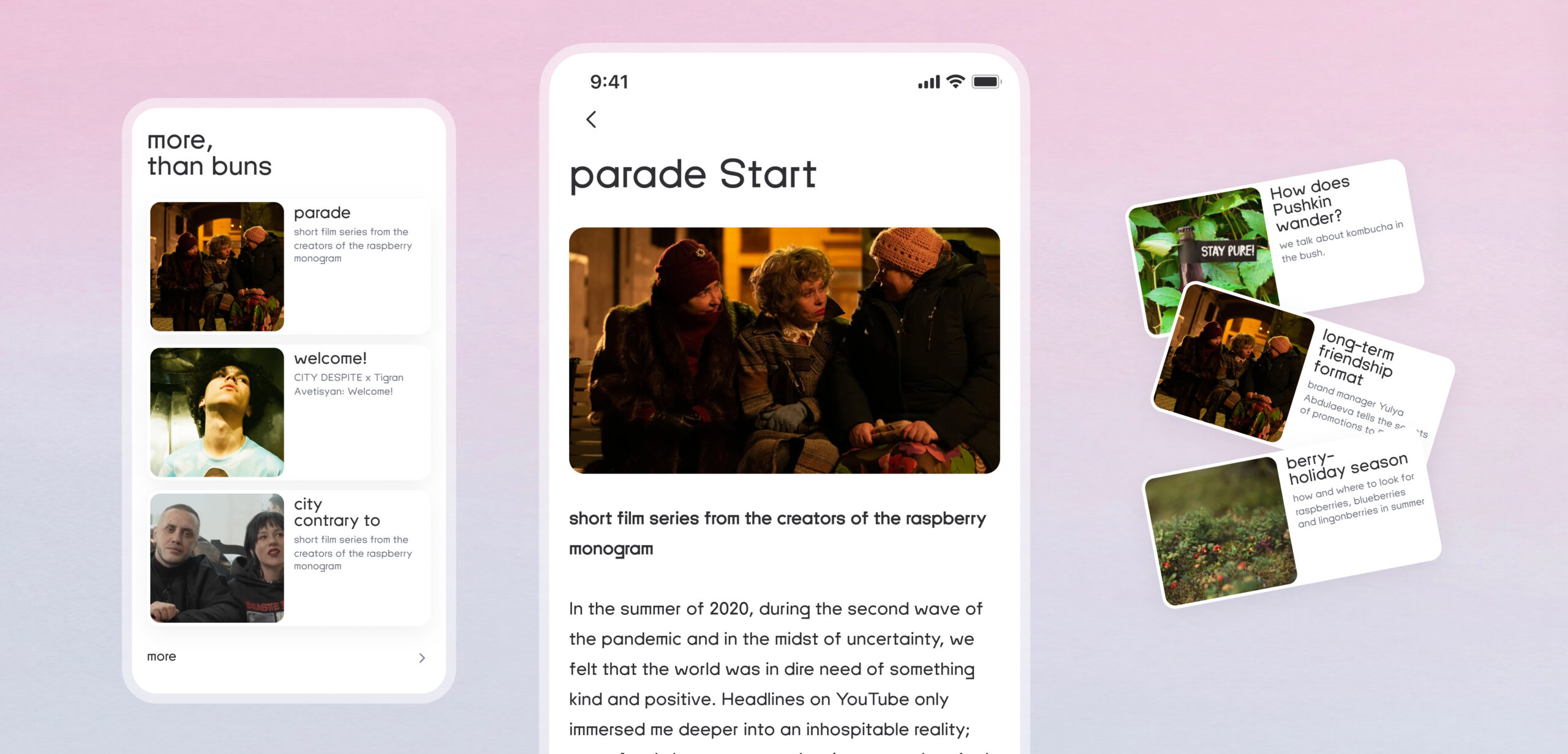
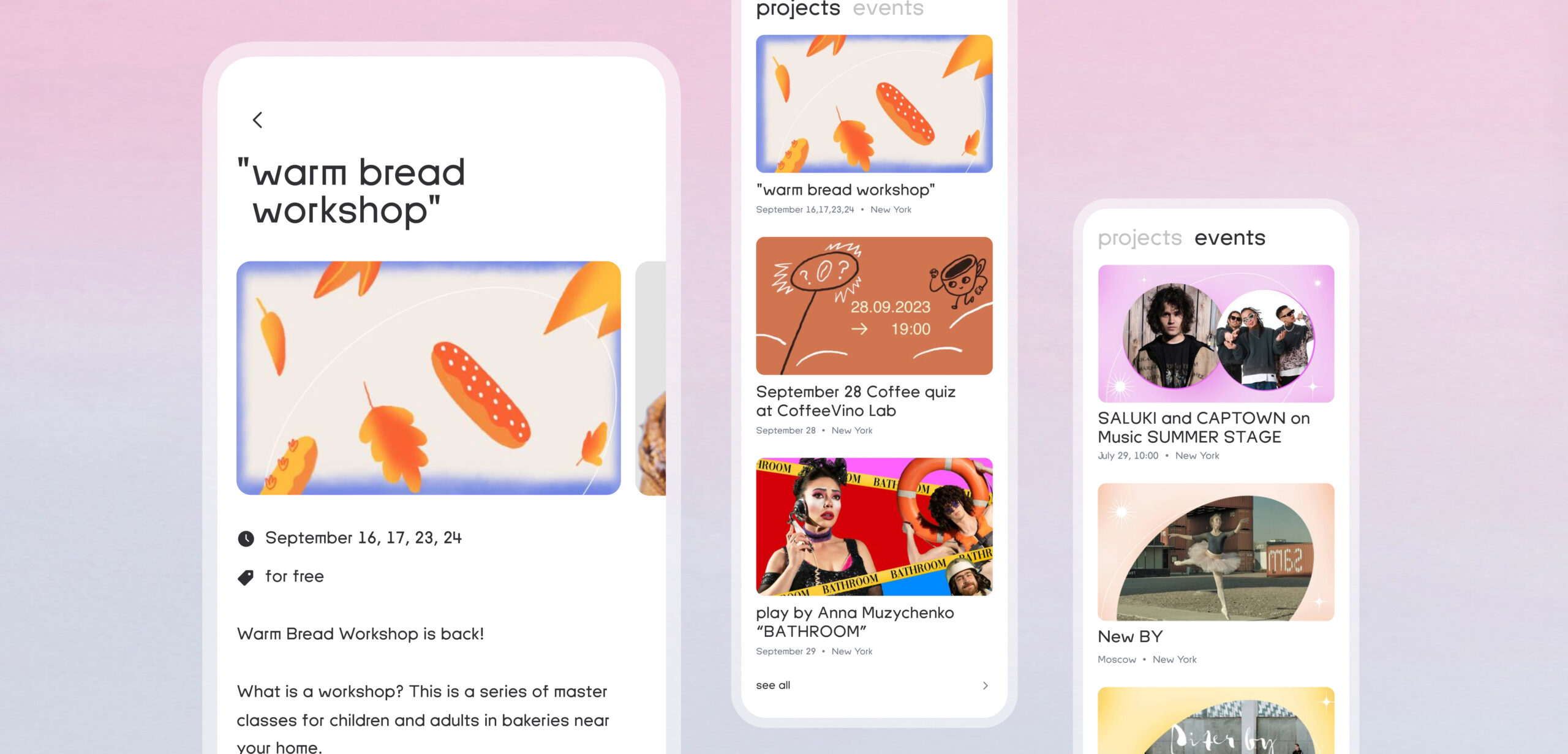
A new section for projects and events has been added. Users can directly access YouTube from the app to watch the latest Bushe project episodes. Additionally, they can read about city events and purchase tickets.
Users can find out about news and promotions in stories or read more details in the ‘Promotions and News’ section
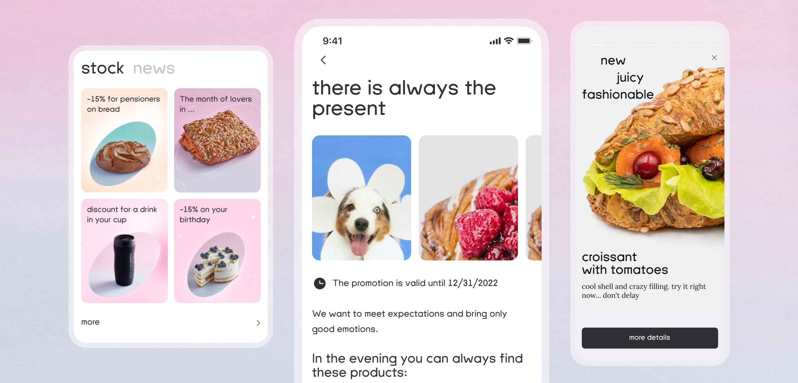
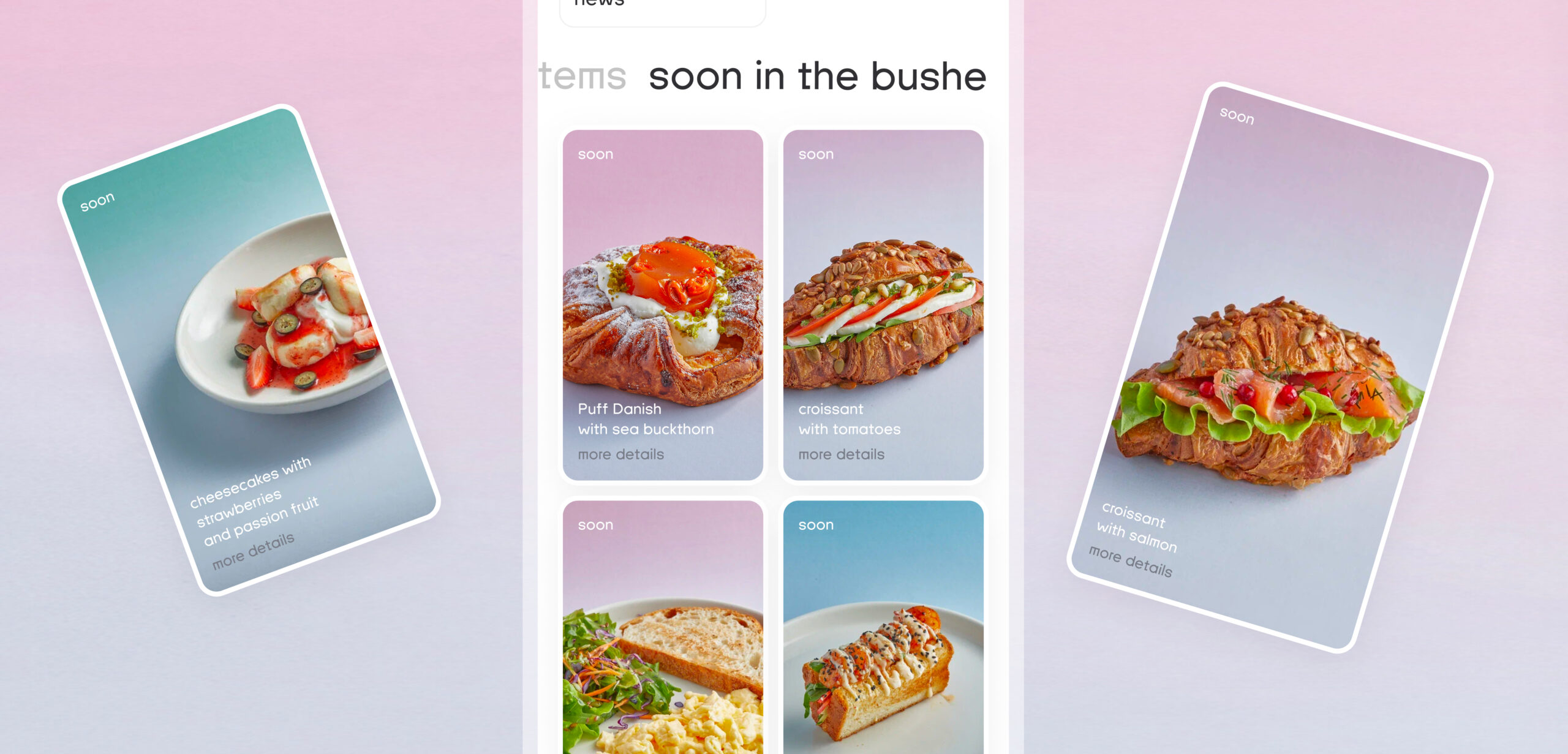
And all the new arrivals are in a separate section, so users will always know what’s new and available to try.
One of the Frontend Solutions
In the new update, many new sections were introduced: promotions, news, and stories. When the app was released, we noticed the complexity of allowing users to click on a product advertised in a story and navigate to the relevant section.
We improved the navigation system, and here’s what we achieved:
Before: You couldn’t directly access the desired screen from a news article or promotion. For example, if Bushe posted a story about a new croissant, and you wanted to go directly to the relevant screen to purchase it, you had to close the screen, go to the catalog, find the relevant category, and locate the desired product.
Now: By pressing a button in the story, you can immediately navigate to the advertised product, item, or event. Users can do this in just one click.
It may seem like a simple change, but from a development perspective, it was a complex task.
Catalog
Finding the catalog is now quite straightforward. It’s located in the tab bar following a familiar pattern. Product cards can be scrolled through in an open view without needing to return to the category. We minimized backward transitions, and adjacent elements are always accessible through familiar swiping gestures.
The client has products that aren’t available for same-day delivery but can be delivered from a specific date. Such products are automatically identified in the cart and highlight the nearest delivery date on the product card and in the cart.
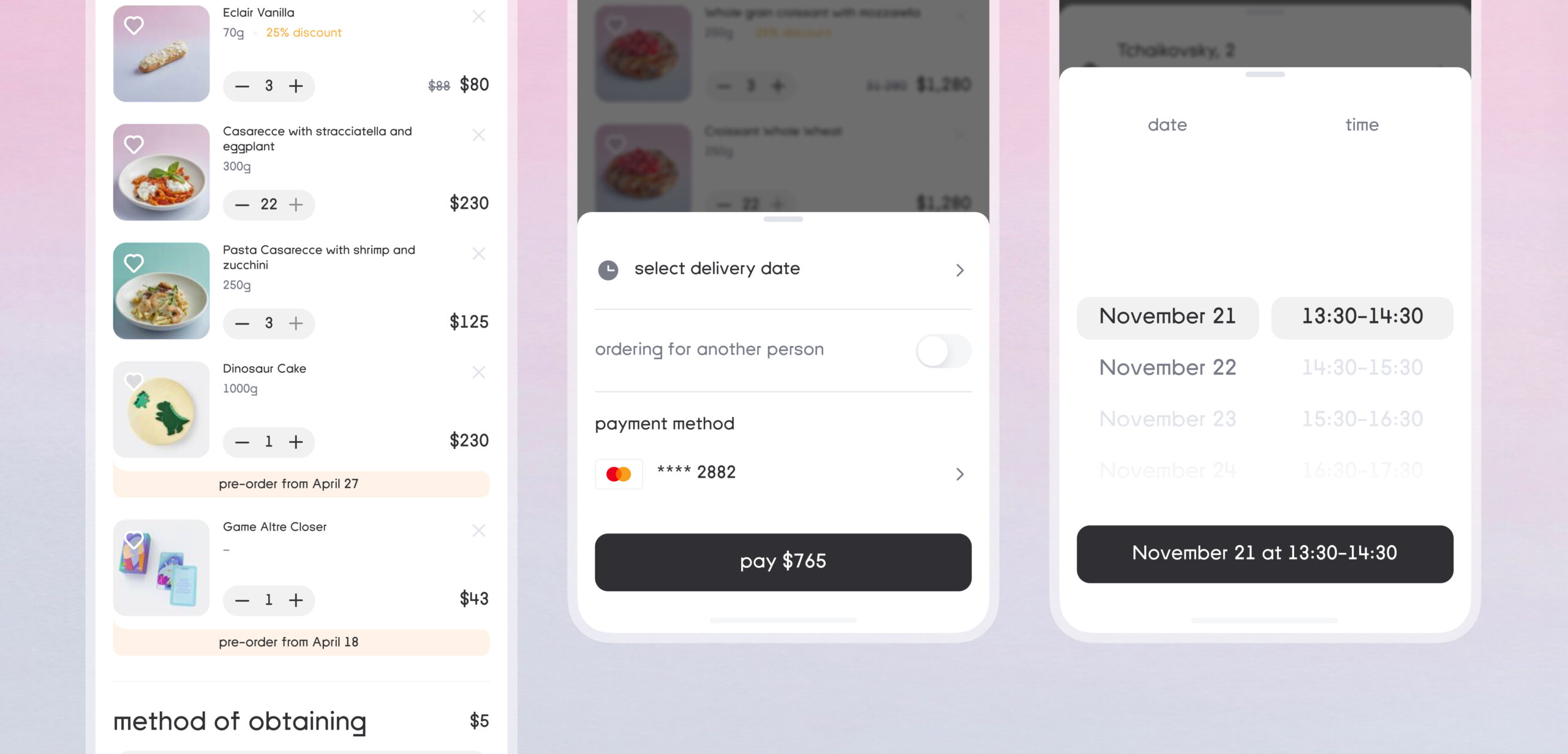
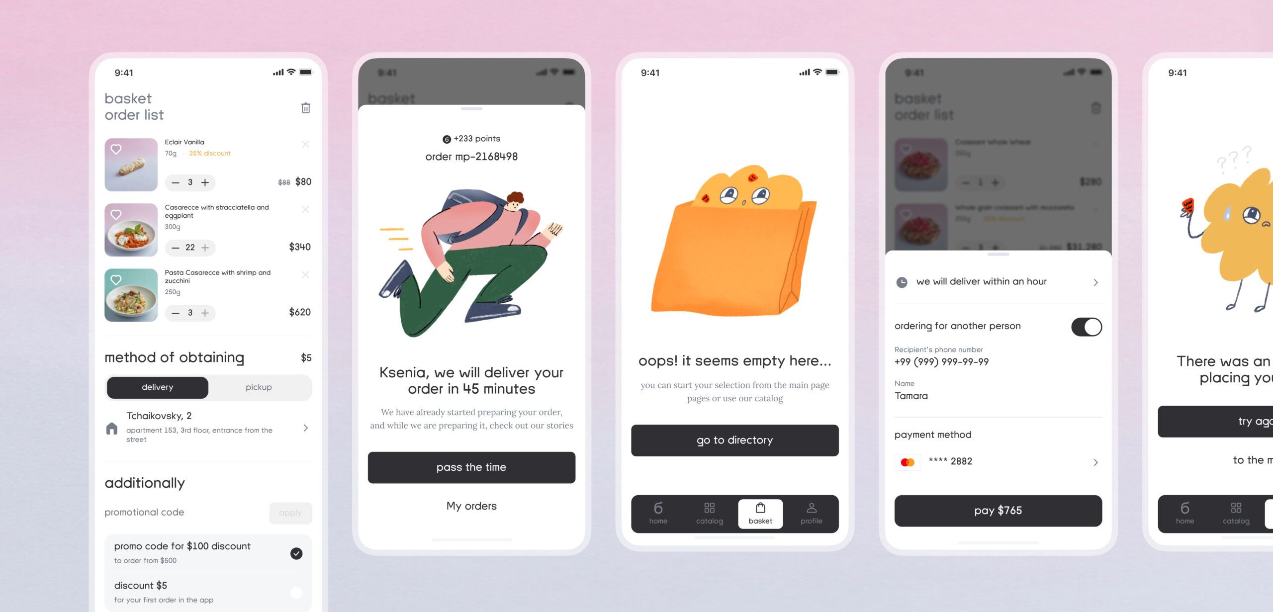
Cart
The shopping cart has become more user-friendly, with the addition of cool illustrations, which, by the way, were created by the client themselves.
Now, you can place an order for someone else, choose a delivery time slot for today, or even pre-order for several days ahead.
Profile
In addition to the standard profile for Bushe employees, a separate custom profile was developed.
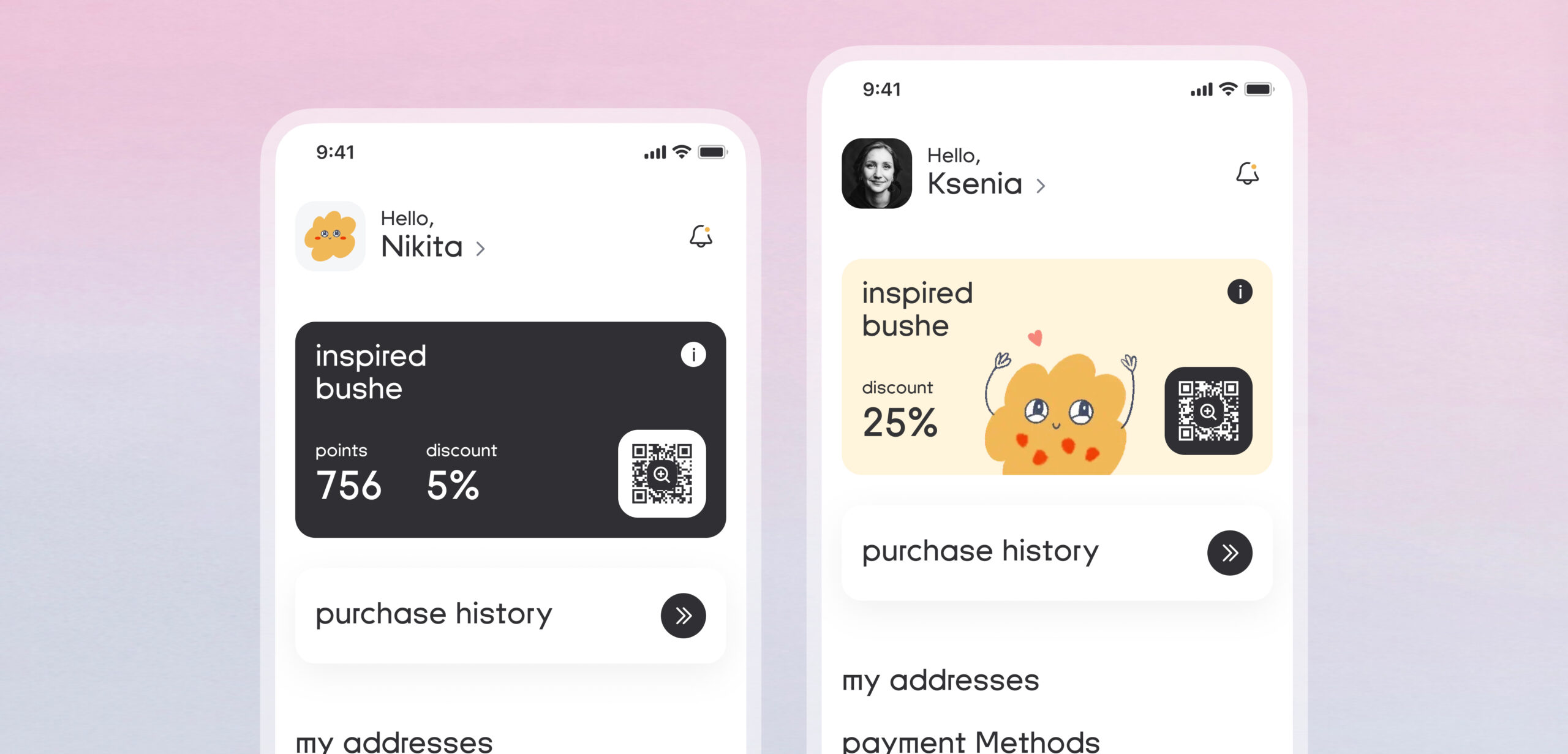
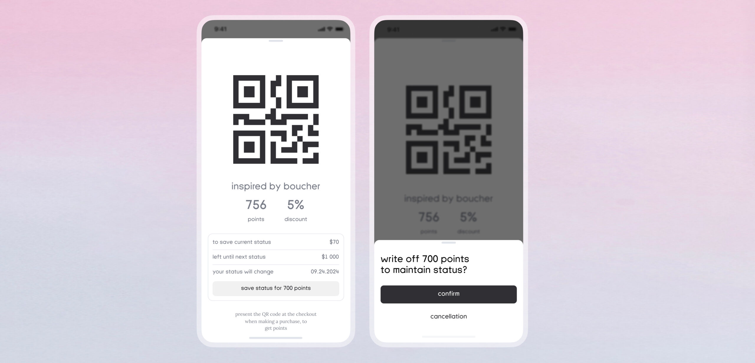
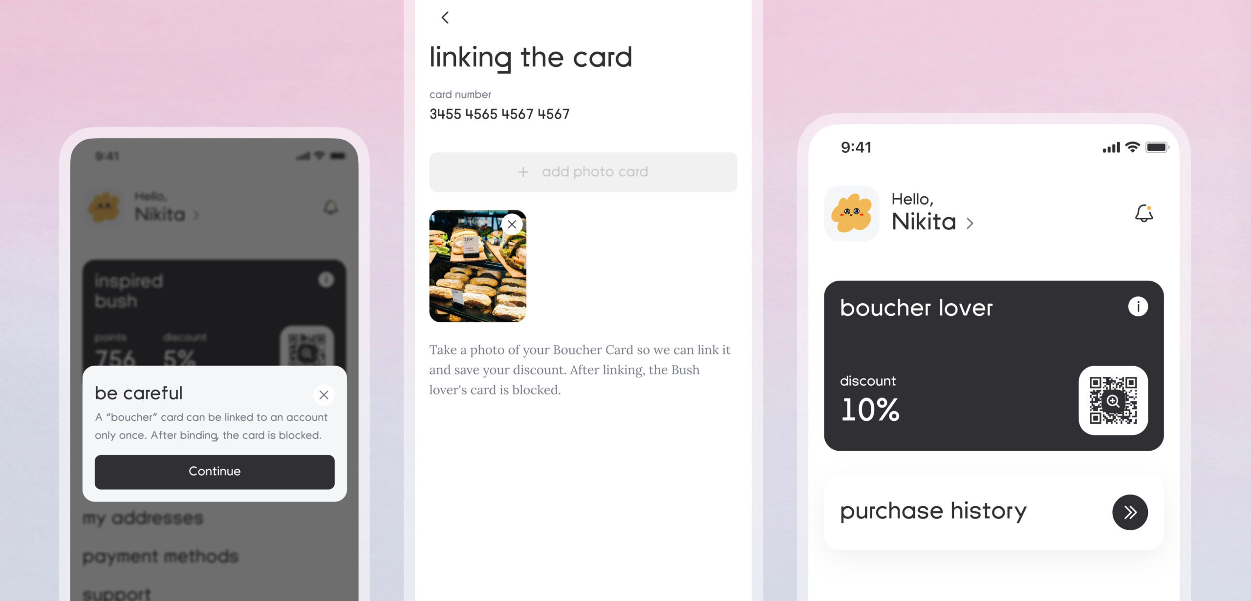
We retained the loyalty system but made some slight modifications to it. Users can now see their status and points in the profile or simply open the QR code on the main screen.
The introduction of a modal window with a QR code and information about guest points significantly simplified the work for cashiers. Now, guests can find out their status and point balance on their own without having to ask the staff. Just open the QR code, and the necessary information becomes immediately accessible. This has improved service convenience and enhanced the guest interaction experience with the service.
When enough points are accumulated, users can redeem their points to increase their status or maintain it.
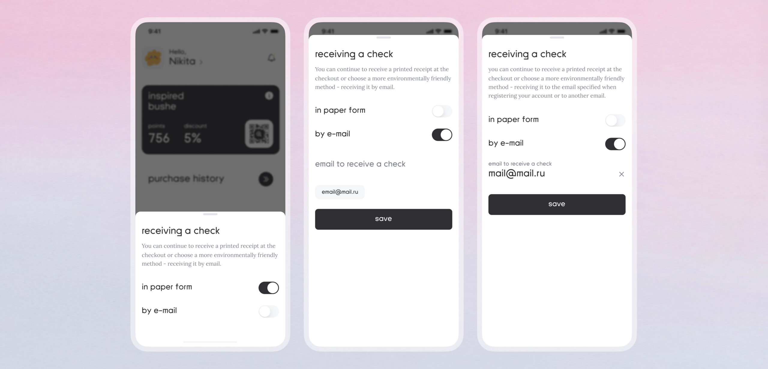
The client is environmentally conscious, so users can opt out of a paper receipt at the cashier. In that case, the receipt will be sent to the email address specified in the profile or another email address can be provided.
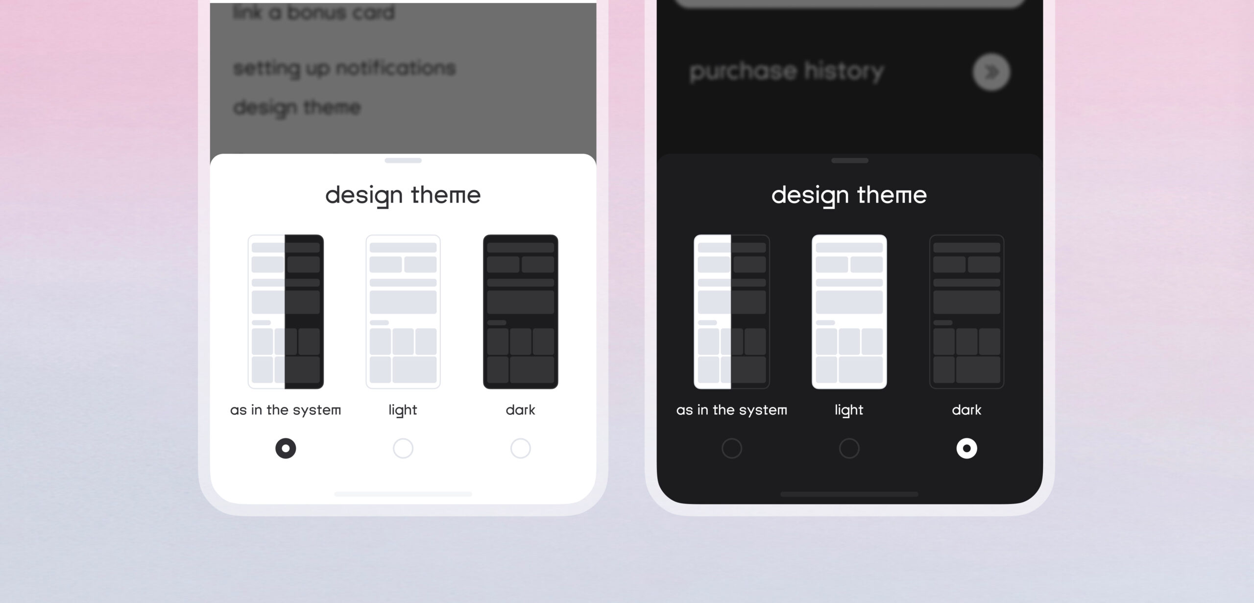
A nice feature: dark and light themes. Which side are you on?
We digitized the plastic loyalty card without losing discounts and bonus points.
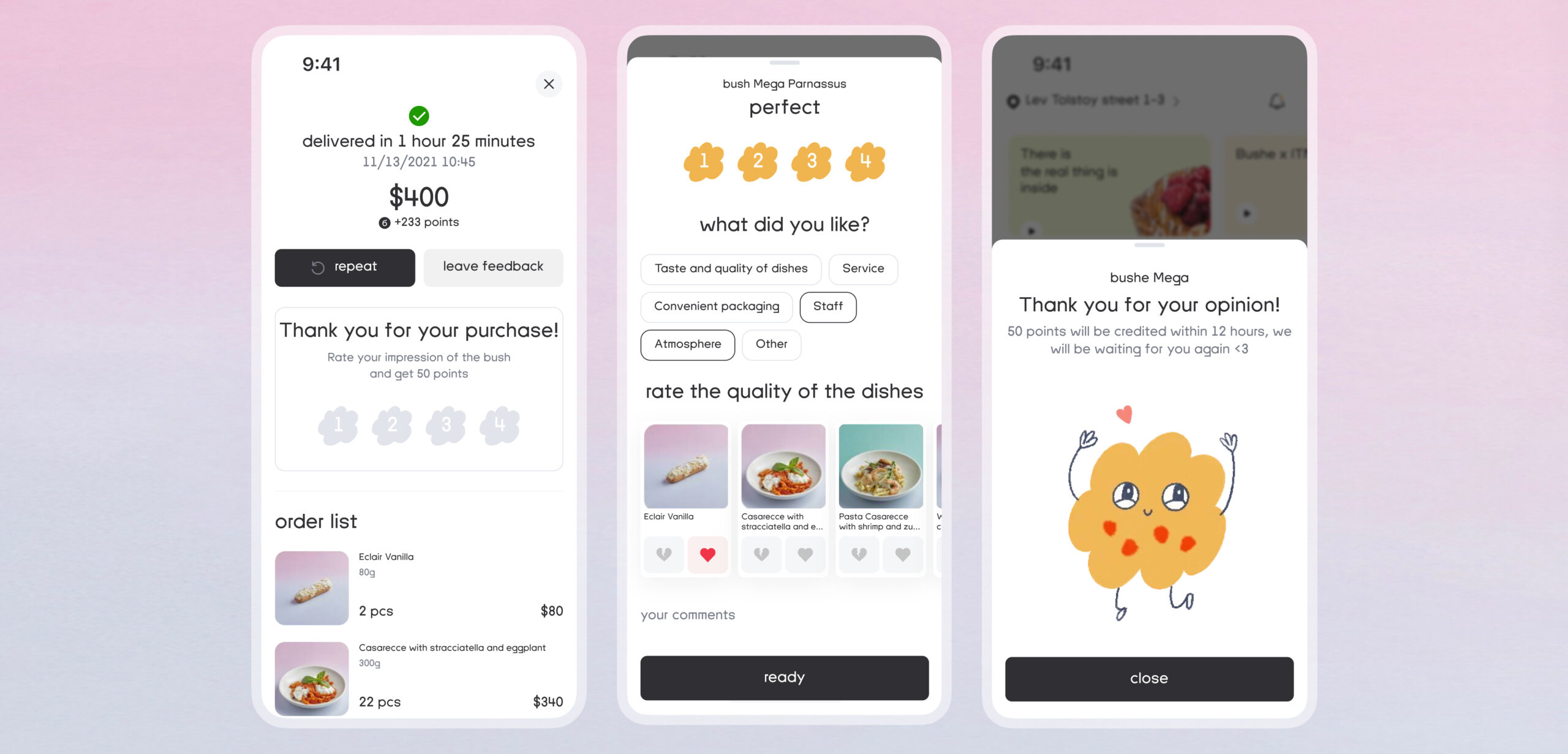
We introduced the ability to leave feedback on orders at any time after purchase. This is important for those who want to help Bushe and the app improve or receive a response from the quality department.
Admin Panel
We developed a new admin panel for the mobile app. In the admin panel, moderators can view all users, send push notifications, and create promo codes. If a user purchases a certificate in the mobile app and for some reason, it doesn’t arrive via email, a moderator can resend the certificate from the admin panel.
All orders from the mobile app, similar to those in the cashier system, are accessible in the admin panel. This duplication allows for quick access to user orders.
We created separate sections in the admin panel for the content on the main page of the app: loading stories, events, projects, promotions, and news
Results
157 000 +
users
27 000 +
new users after the update
20 000 +
orders via the mobile app
Tech stack
React
Laravel
Kotlin
Swift
Postgres
Figma
Team
Artem Rybin
Backend Lead
Nikita Vyaskov
Backend Senior
Alexander Heger
iOS Lead
Agil Hajiyev
iOS Lead
Ilgam Ayupov
Android Lead
Iskender Murzaliev
QA
Dmitry Volkov
DevOps
Nikita Opalinsky
UX/UI Design
Diana Alekseeva
Project Manager
Alexey Popovkin
Project Manager