We use cookies. They allow us to analyze the experience of visitors to our website and understand you better. By continuing to browse the website, you agree to our use of cookies.
Creating a user-friendly interface for pilots
Discover how we designed the interface of a mobile application for S7 Airlines’ pilots together with the flight crew.
S7 asked us to design a mobile application for pilots. We have been developing the most complex back-end, front-end, and mobile projects for them for over five years. Currently, we are developing a mobile application for flight attendants, and it was essential for us to leverage this experience for the pilots’ application.
Goals
- To eliminate the use of paper media by the pilot-in command.
- To speed up the process of pilots receiving updated documents for flights
- To transfer reporting procedures into electronic form.
- To simplify the flight data acquisition by creating a united workspace.
Why not opt for a pre-made solution?
- The app should be more user-friendly through custom development taking tailored to the specific needs of S7 pilots.
- Development should cost less than purchasing an off-the-shelf solution.
- Application support expenses should be less than those from of a foreign vendor.
- The app’s functionality should remain unaffected by sanctions.
Challenges
Security. Being an aircraft pilot is the most responsible job in the world bearing the weight of hundreds of lives.
Research. You can’t apply Yandex.Surveys or do Hallway Usability Testing, unless, of course, you live with pilots under the same roof.
Domain. There are very few analogues in the world and they’re all from different countries. However, our experience in developing applications for flight attendants helped us here.
Work stages
Analytics
S7 Airlines provided the application’s requirement specifications, and from our end, we had to study similar projects and come up with the design.
We asked pilots to share apps they like and also conducted our own search for the best applications. Our team outlined the pros and cons of each screen:
Prototyping
We skipped the prototyping phase as we already had a UI kit from the flight attendant app that allowed us not to build apps of black-and-white blocks. However, if you don’t have a UI kit, it’s definitely worth beginning with prototypes.
Testing on pilots
An incredible focus group was formed: six active pilots and instructors. It’s impressive how S7 values its employees and involves them in product development from the early stages. This is vital as analysts may not be a direct user and could make mistakes in hypotheses regarding usability or the necessity of prioritizing certain information.
We had 14 in-person meetings. At each meeting, we displayed the interface, and the pilots had to intuitively understand the displayed content and locate the necessary information within the app, without any hints. This way, after 14 meetings and 35 days, we’ve reached a level of intuitiveness that is apparent upon the user’s first interaction with the app.
Authentication
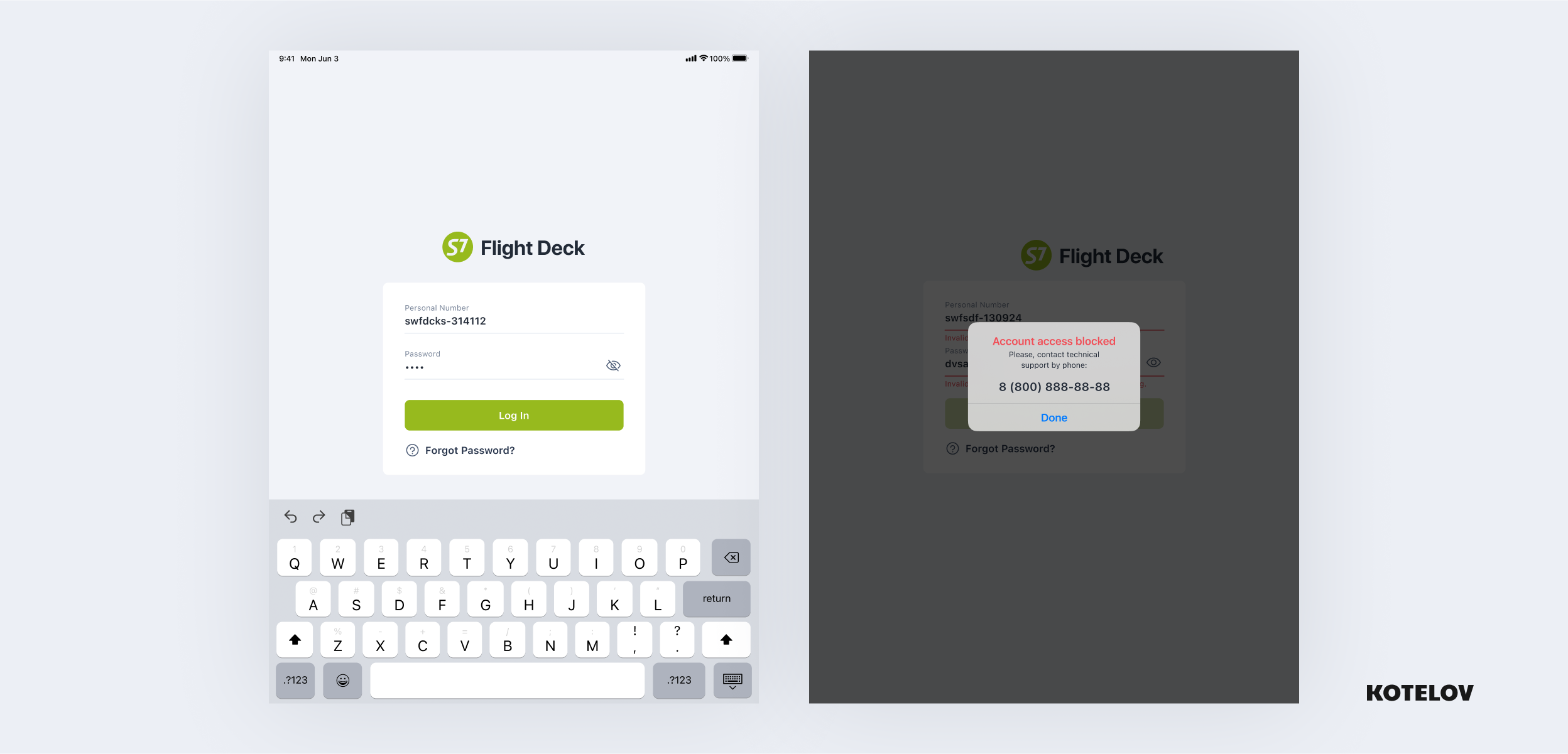
The pilot enters their employee ID and password. We adopted this authentication method because it uses the same credentials across all the company systems, ensuring that the pilot won’t forget them before the flight. However, after 10 incorrect password attempts, the system locks, and the access can only be restored through the administrator. This is for the sake of data security in case the tablet is lost:
Flight calendar
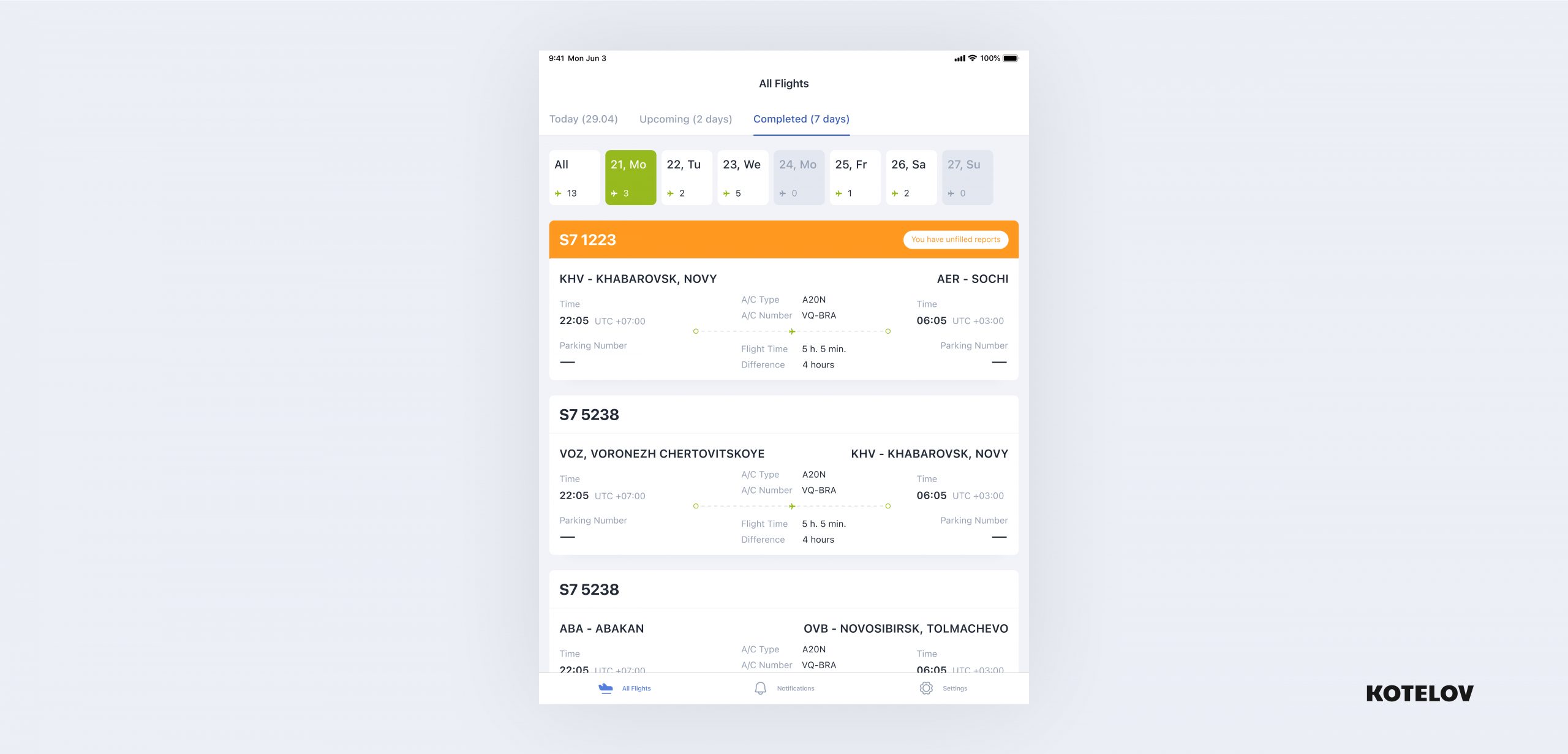
We’ve designed a user-friendly flight calendar. The pilot can view their workdays, and we also highlighted non-operational flights in inactive blocks. We differentiated flights for which the pilot hasn’t completed reports by marking them.
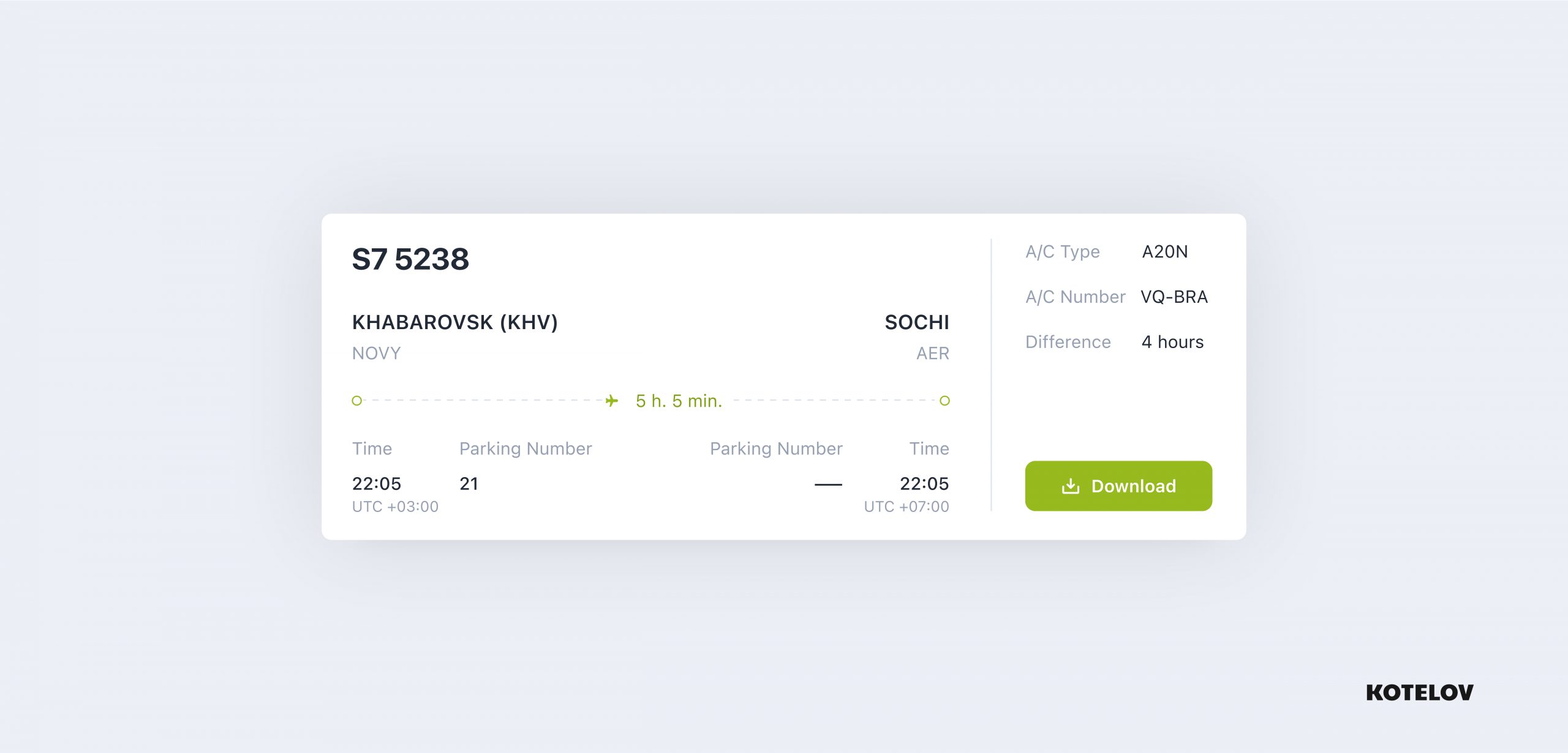
We’ve meticulously detailed each flight entry. It’s updated during the flight, for example, with a parking bay assignment. We’ve gathered insights from pilots about their top priorities, which we then focused on. Additionally, we added a “Download” button for downloading and refreshing flight information only when needed, considering roaming charges across various countries.
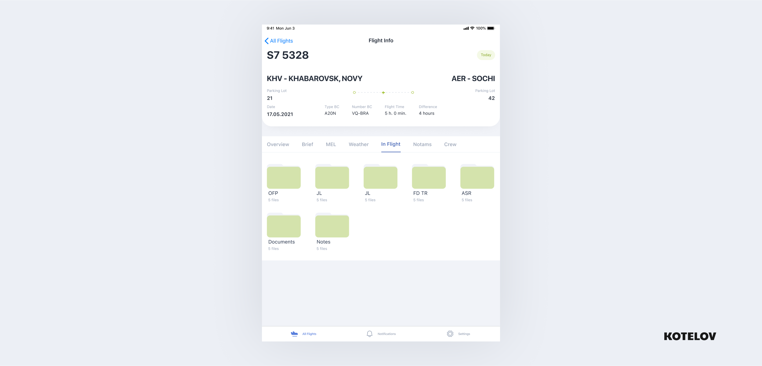
Flight Information
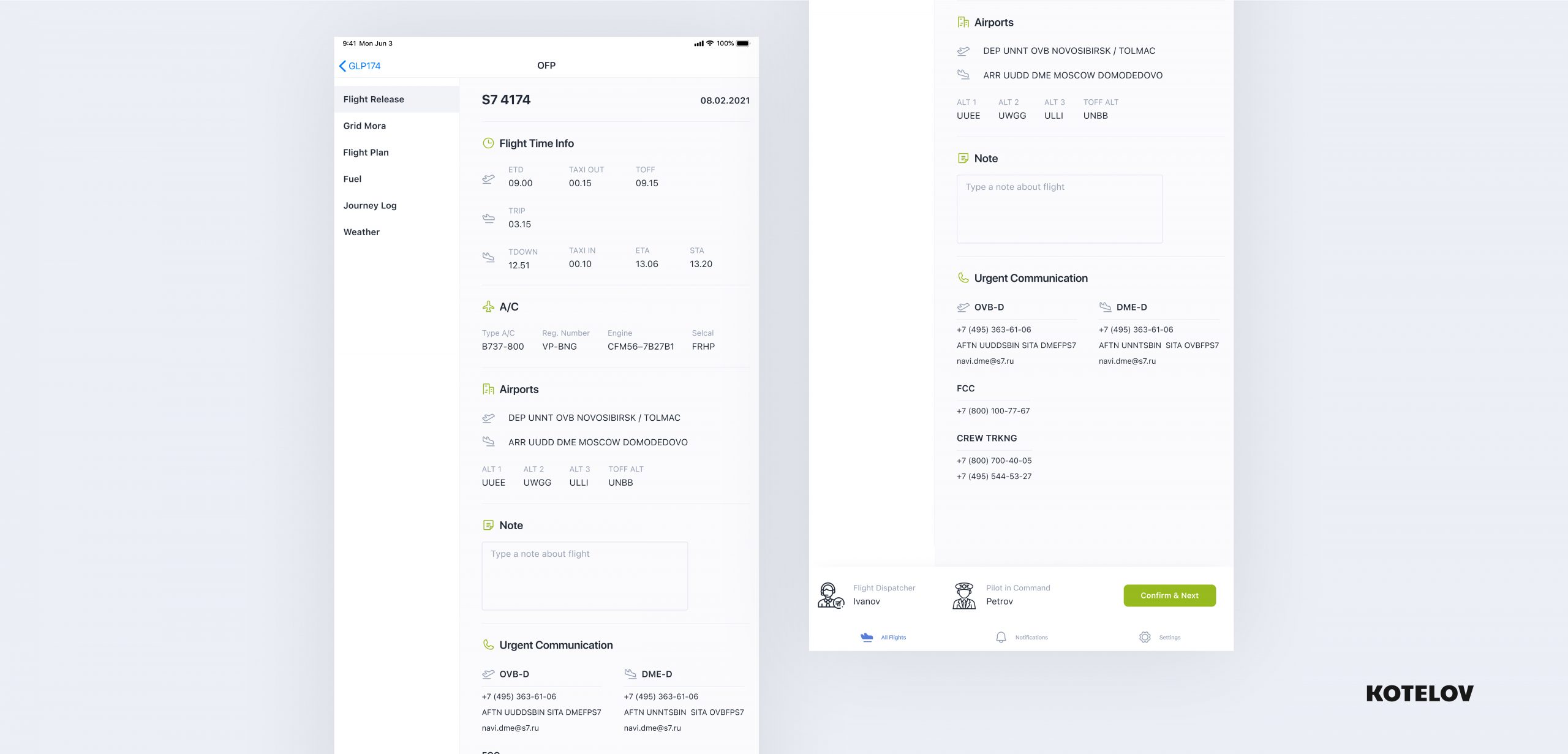
We have designed a tabbed Dashboard with the main flight information.
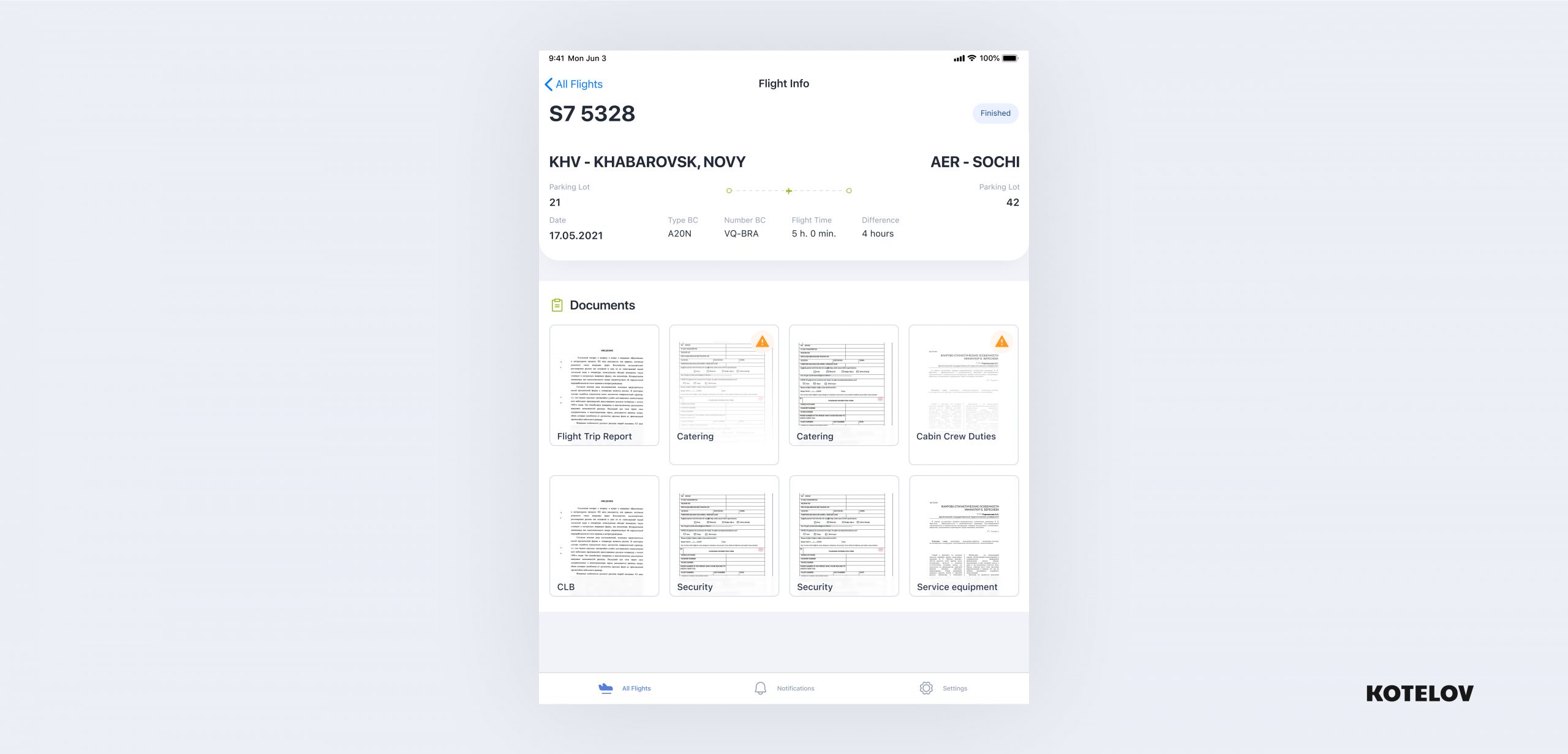
Documentation
We have organized the flight documentation into a convenient structure
Displayed documents with previews for quick readability
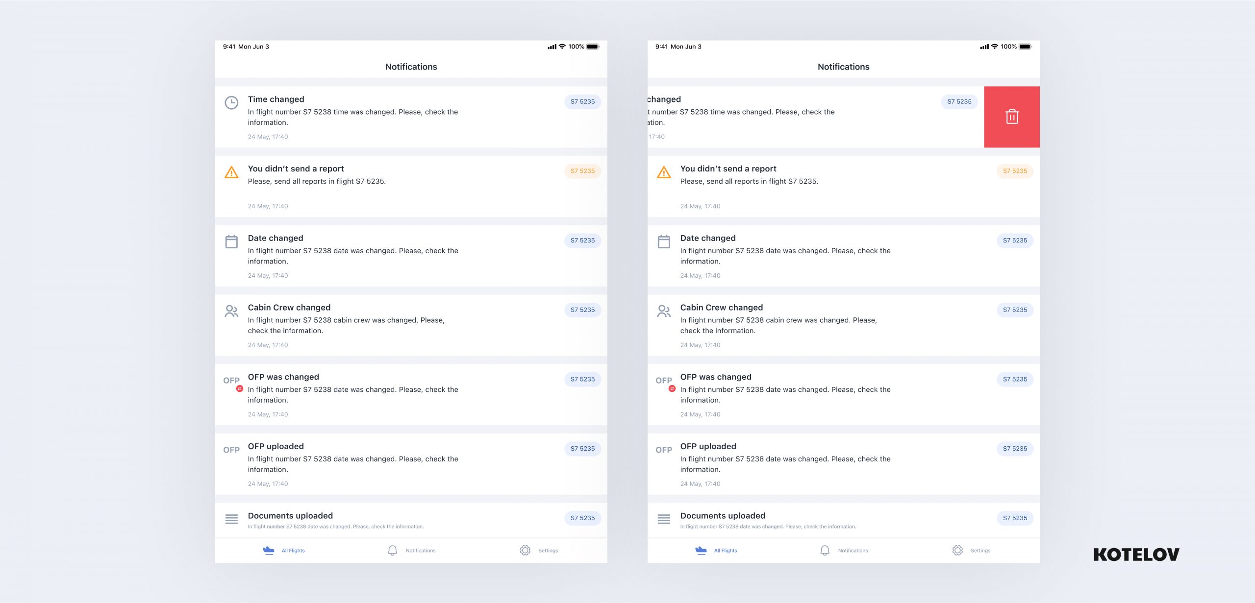
Notifications
We have designed a notification system that displays changes in flight data and information within reports in a convenient way:
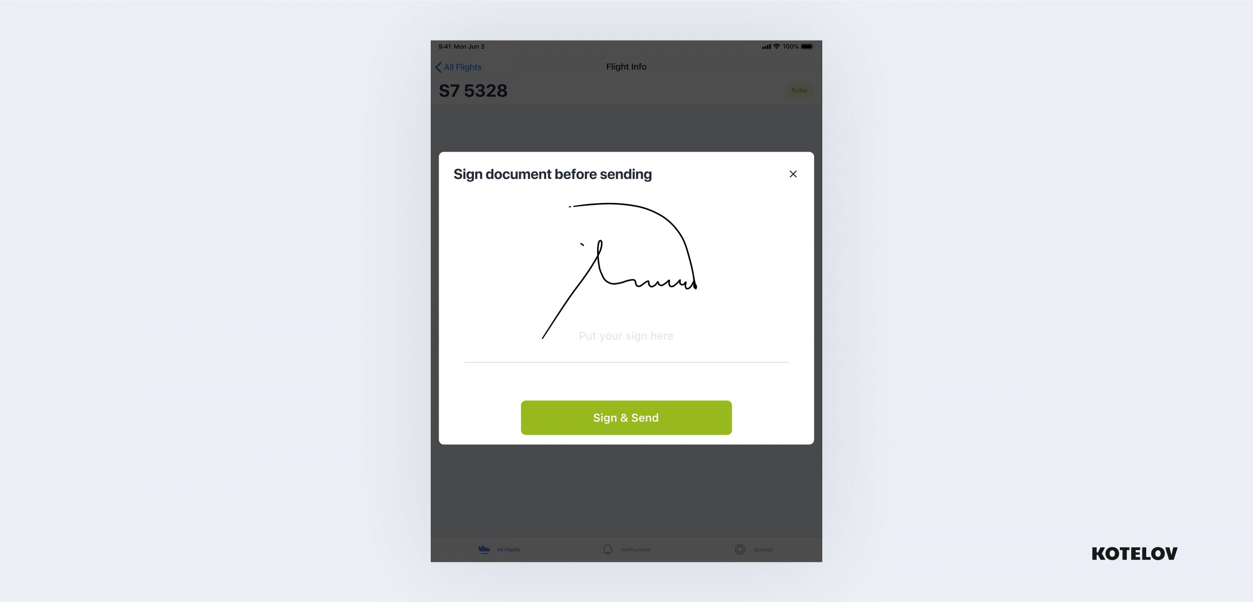
To meet regulations, the pilot-in-command signs flight reports manually:
The result
In the future, the project will move to the development phase, with the system being immune to sanctions, offering a foundation for a long-term strategy focused on pilots’ workflow automation and convenience.
Special thanks go to the S7 Airlines for their eagerness to implement such large-scale projects and for allowing us to be a part of it.
