
We use cookies. They allow us to analyze the experience of visitors to our website and understand you better. By continuing to browse the website, you agree to our use of cookies.
UX/UI audit of the Caesar Satellite website
UX/UI audit of the Caesar Satellite website
Task
KOTELOV must conduct a UX/UI audit of the Caesar Satellite website, identify weak points in UX/UI that lead to lead loss.
Project Goals
Marketing and Service Departments
- Increase conversion on the site: understand the current situation and form hypotheses for its improvement;
- Analyze the site for the accessibility and clarity of key information: USP, company advantages and services, service descriptions, etc.;
- Analyze site navigation and interaction mechanics with site functionality;
- Understand what to do next.
“On the site, if possible, it is necessary to simplify the client’s life as much as possible, make it easy. Achieve clarity, synchronize customer needs with what is happening on the site. Put this in a simple picture and display it on a call to the call center.”
CEO of Caesar Satellite
Stages
Information Gathering
- Conduct a series of interviews with stakeholders;
- Analyze incoming materials from the client team: CJM, user portraits, presentations, etc.;
- Collect insights, ideas, and problems on the websites of the two main competitors (Golf and Delta);
- Analyze positive and negative reviews on various resources;
- Analyze and collect insights from Yandex.Metrica.
UX/UI audit of the Caesar Satellite website
- Identify problem areas in terms of information meaning and structure, usability, and visual design on the site.
Conclusion
- Describe key issues, insights obtained, and form hypotheses for their improvement;
- Prepare a presentation with the work results.
Key Findings
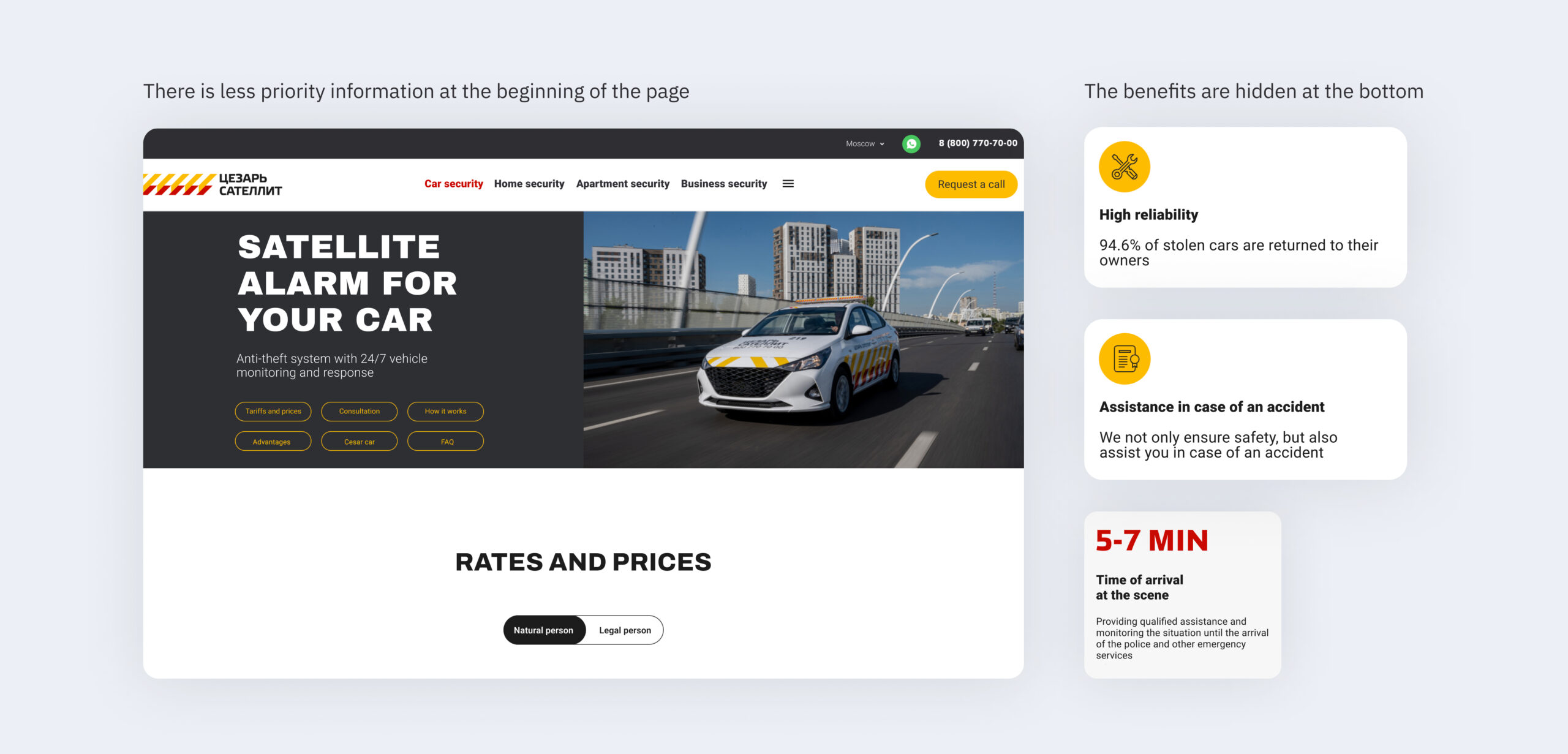
Finding 1: Conversion of OS forms can be higher
We analyzed the effectiveness of lead forms on mobile and desktop. If previously the focus was more on desktop – it turned out that the conversion value on mobile and desktop is comparable. But the main problem is chaotic lead forms without clear value.
Insights
- Mobile traffic predominates over desktop by several times;
- In desktop, the conversion of forms is higher;
- In desktop, the depth of views is significantly lower than in the mobile version.
In desktop, users reach a maximum of the second or third screen. In the mobile version, the depth of viewing after the second and third screen drops by +- 10% and remains practically until the end of the page.
The data obtained was verified by webvisor analysis (100+ sessions on 1 page).
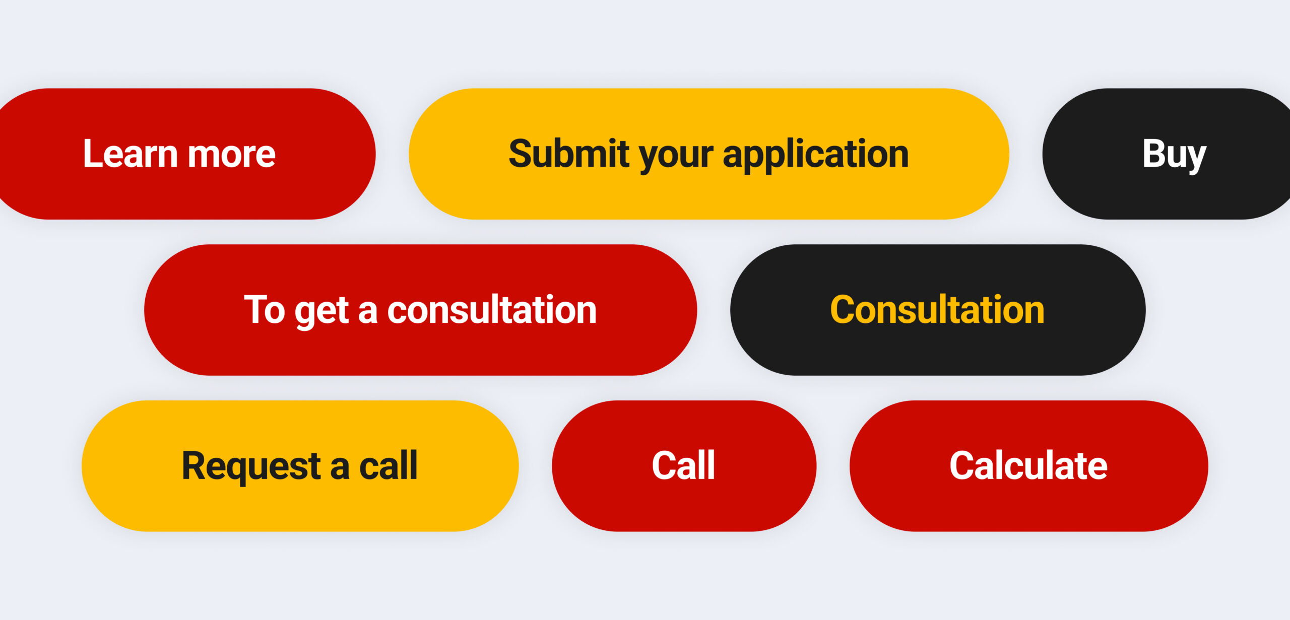
- No form explains what value the user will receive.

- The site has about 11 different names for the same CTA → Users practically do not interact with CTAs that are in a prominent place (header).
Hypothesis:
- If we raise the key meanings and actions by 2-3 screens (from a sales perspective), then the conversion on desktop will increase.
- Traffic conversion desktop = traffic conversion mobile in its significance, despite the difference in the number of visits.
- If forms explain clear value, i.e., address pains, users will be more willing to interact with them, and the conversion will increase.
Finding 2: the site’s information architecture is chaotic and does not work in conjunction with navigation
Insights:
- Currently, the user is an explorer: navigation in the header and on the pages does not fully reveal the company’s service structure → site pages do not narrow the funnel to the key action.
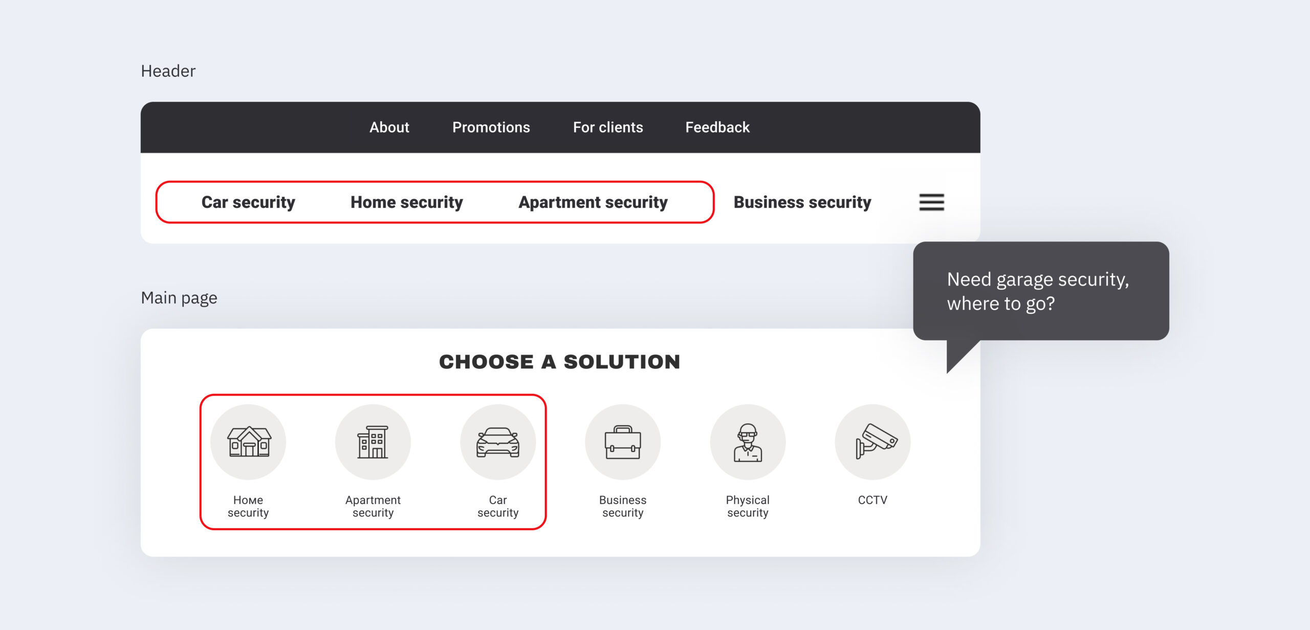
- Information is difficult to access – if a user wants to buy a specific product, they will have to think about how to do it, where to click.
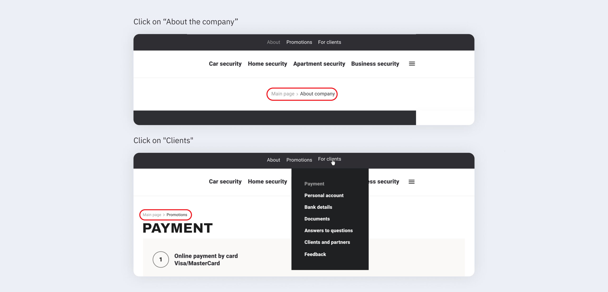
- The header and additional navigation elements, such as breadcrumbs, do not create a unified navigation pattern.
Hypothesis:
If we create a sequential, narrowing funnel, information architecture (from the main page to the page with a specific service and its CTA), we can address user “pains” at any stage and increase conversion. Wherever the user is, they should be able to navigate to any level of the funnel: “main page – service group – service – CTA”.
Finding 3: Key meanings on the site are hidden from the user or absent altogether
Insights:
- There is no clearly formulated USP overall and for each service separately.
- Important information is hidden behind buttons or buried deep on the page.
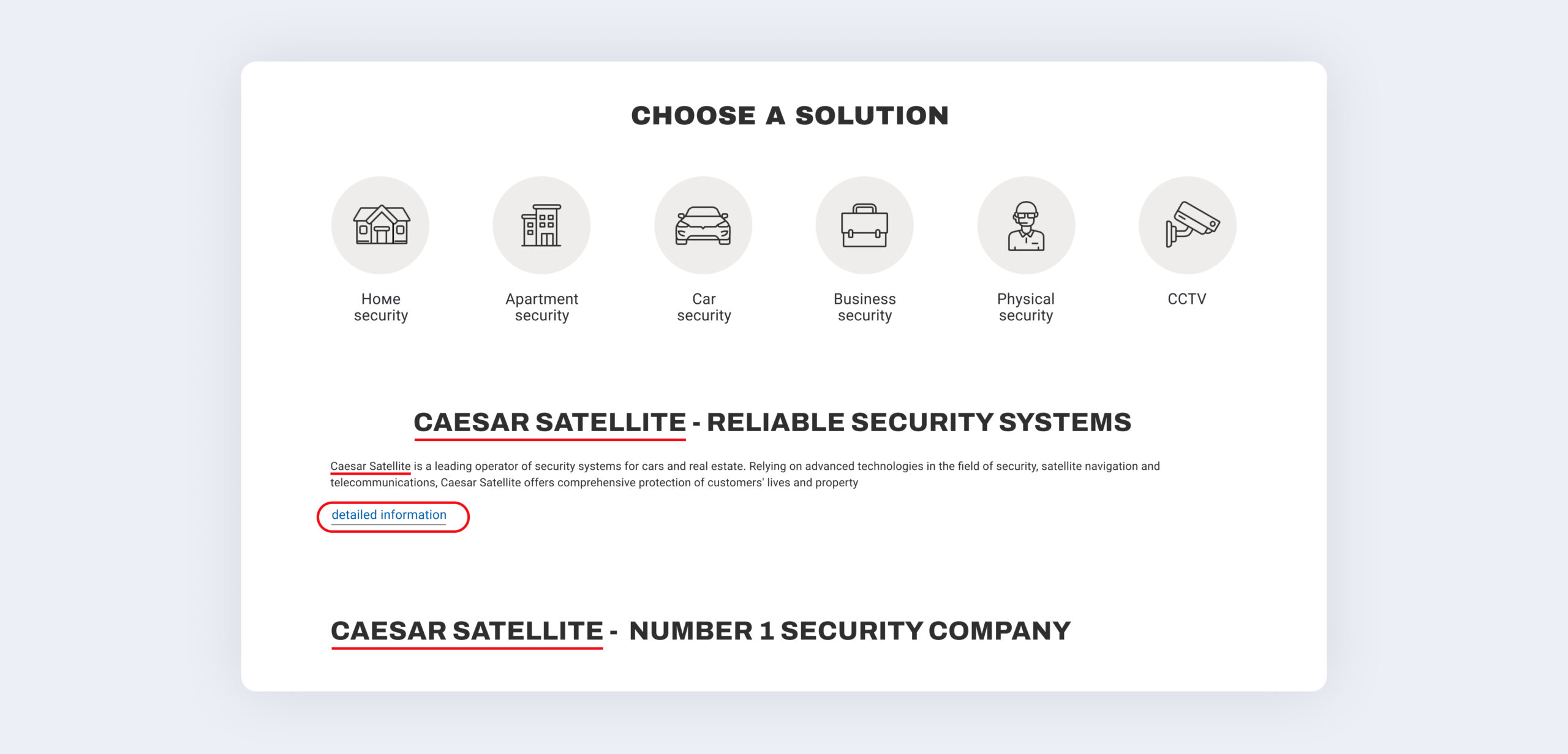
- Some blocks are unreasonably repeated several times and do not provide value to the user.
- There is no prioritization in information presentation. The accents are poorly placed.
 Hypothesis:
If we change the priority of information presentation, describe the key value, and place the necessary accents, we can increase user trust and conversion.
Finding 4: There is no unified approach to visual design on the site.
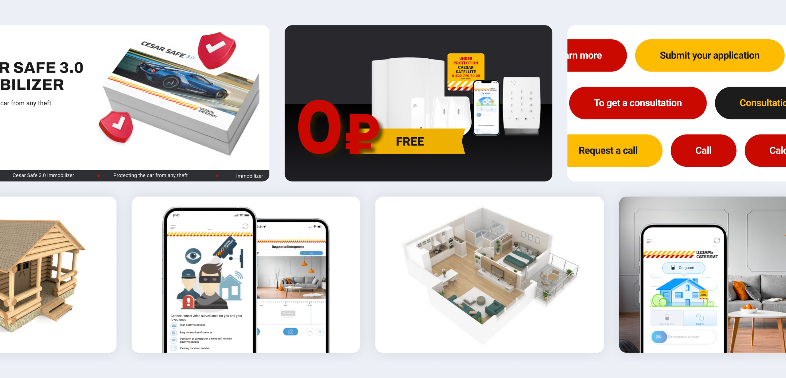
Hypothesis:
It is necessary to prepare a comprehensive design concept, guidelines, a unified UI kit that will shape the brand’s visual identity and increase customer loyalty.
Finding 5: There is no unified atomic approach in organizing site components and pages
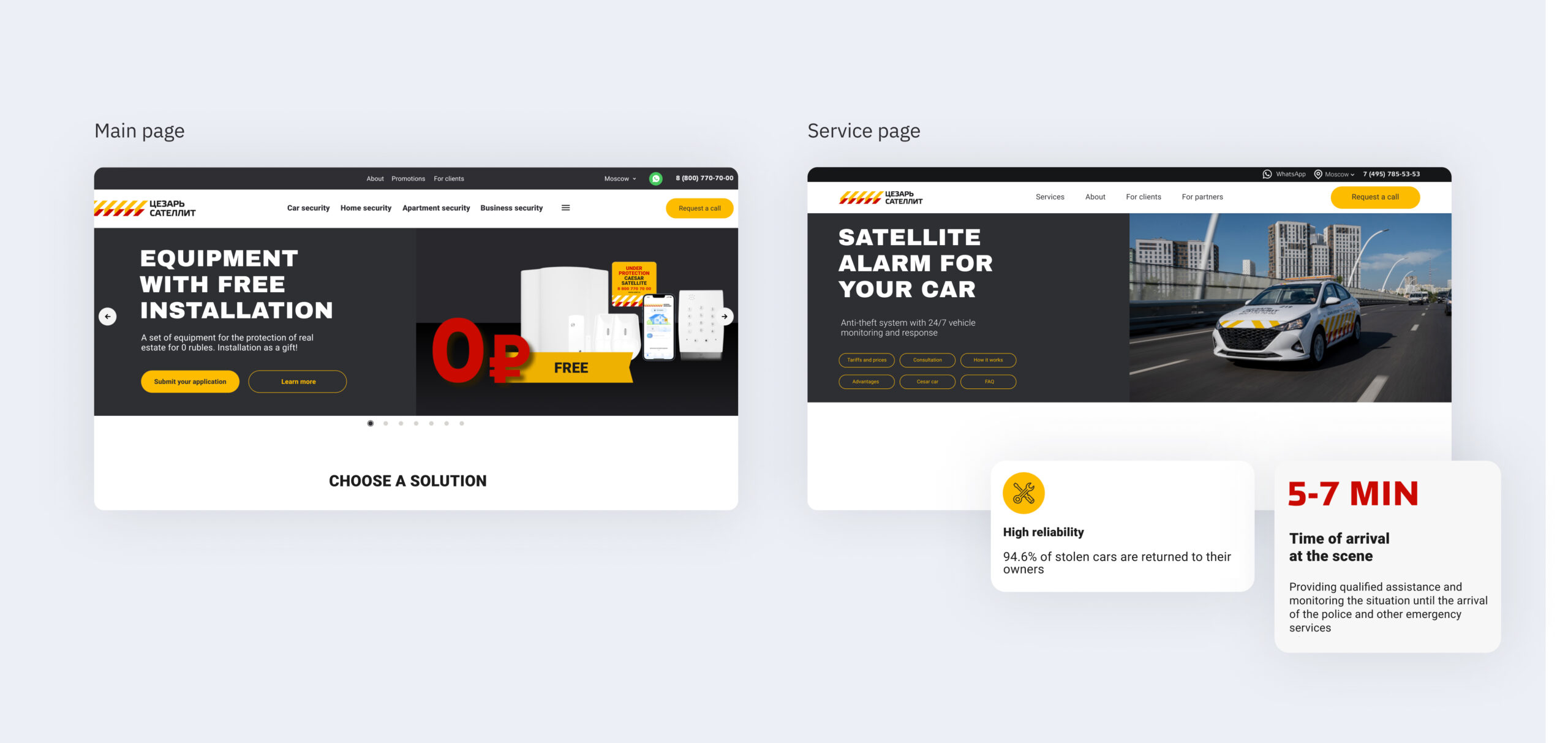
Using the example of the services page: the pages do not have a unified template and do not create a consistent pattern for users.
Similar information is located in different places. Many unique blocks that are not reused anywhere. The information presentation order is chaotic.
The cost and speed of creating new pages and making changes to current ones, for example, after A/B testing, can be lower when using modern design practices.
Conclusion
- Conversion of OS forms can be higher;
- Key meanings on the site are hidden from the user or absent altogether;
- The site’s information architecture is chaotic and does not work in conjunction with navigation;
- There is no unified approach to visual design on the site;
- There is no unified atomic approach on the site.
After the research, the company implemented the recommendations and began working on the site.
Tech stack
Miro
Google Analytics
Team
Daniel V.
Art-director
Elen C.
UX-searcher
Diana A.
Project manager